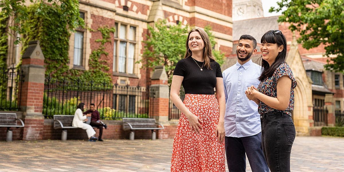
Three students standing outside the University of Leeds
University of Leeds

Helping students find answers faster at one of the North's top universities

Accessible, streamlined content that cuts the clutter from the University of Leeds student site.
Web copywriting
Accessible content
Content design

"Working with you on this project has been great – you’ve played a huge role in making important student information more accessible."

Stacey Kelly, Digital Communications Manager at the University of Leeds

What they wanted: Answers, not essays

Over the years, the University of Leeds student website (students.leeds.ac.uk) had grown bloated and inconsistent. Information was spread across too many pages, written in too many different ways, and students were struggling to find what they needed.

The university's content team had already cut the number of pages. But many of those that remained still needed rewriting, with accessibility as the priority.

Penny Brazier, founder of The Mighty Pen and host of #copywritersunite Leeds, invited me to join her on the project, alongside fellow writer Fay Nyberg .

What I delivered:

1. An accessible refresh of existing content

This wasn't a storytelling brief. The university already had brand guidelines, so the focus wasn't voice. They wanted content stripped back to what students need to know, with clear routes to where they need to go.

That made content design and user experience the priority: plain English, clear headings and scannable sections, so every student can use the site, whatever their needs, and find answers without wading through unnecessary detail.

2. Content that gets students to answers quickly

There were two big challenges. First, I reviewed a large amount of information across many pages and decided what to cut, keep, or merge. Second, working out what students need to know first, and ordering every page around it.

Working closely with the university's content team, I reduced each page's content and made what remained work harder. Less scrolling, fewer dead ends and quicker answers.

3. Useful cross-linking only

Over the three-month project, I also made sure every internal link moved students forward, not around in circles.

I cross-checked each link on the existing pages against the new ones we were creating, so no one would be sent down an unhelpful path. The university's team then reviewed the content and applied it to the new site.

The results?
See them here for yourself.

A student site that's easier to navigate and more accessible, from a team who says I "played a huge role in making important student information more accessible".

ClearCut - Ready to cut the jargon?
Don't worry! We won't save or use what you submit for anything other than this...
Scroll down!